The Difference That Makes All The Difference
The perfect book exists and I have found it. Lost for years in the darkest corner of my bookshelf, it only appeared as I was packing things up in boxes yesterday. It scattered across the floor after it bounced out of my hands full of good cheer, clearly overwhelmed with joy and desperate for attention as it couldn’t wait to be held and read and cared for again. Picking the book up off the floor, I had an incoherent rush of feelings though: the book is easy to hold! It lies flat if you open it up at the center! The pages are woven together like silk!
It is a delicate, beautiful, perfect thing. The format, the size, the margins, everything. Perfect. And it is, of course, Fred Smeijers’ Counterpunch.
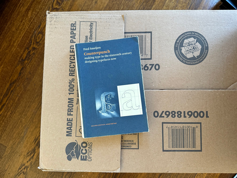
Published in 2011 by the Hyphen Press, Fred goes on a whirlwind typographic adventure to understand how metal type was first made by hand. He learns what it takes to make counterpunches, which are little metal blocks in reverse of the shape you want to eventually print.
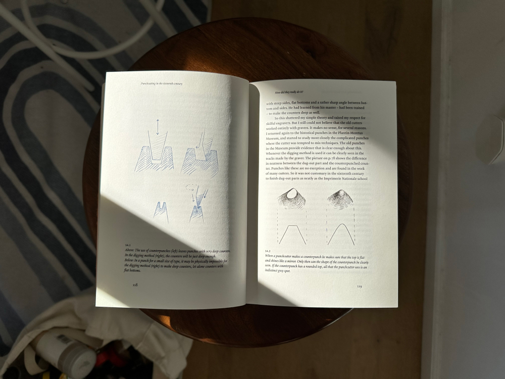
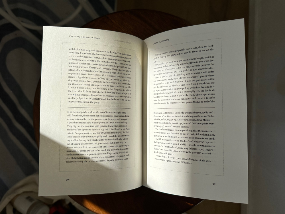
Punchcutting was the technique responsible for 450 years of typographic letterforms. [...] So I started to cut punches on my own. The first attempts could not have been more discouraging. My respect for the contents of the Plantin Musuem went up by the minute. After some time I realized that I could not do it: not today, not tomorrow. The only thing to do was to ask for help from my father: a man put into a machine-tool factory at the age of 14, just after the Second World War, in order to play his role in rebuilding society. For as long as I have known him, there has never been anything that he could not make, repair or explain – if it concerned metal and mechanics.
With the help of his father, Smeijers then carefully explores how metal type was made and what it requires from its maker.
It only makes sense then that a book about caring for small details cares cares for the details, too. As I stopped packing everything up I sat on the floor and began reading, poking at these feelings I had for this book. Why is it different from all the others on my shelf? Many of them are beautifully written, some are even beautifully designed, but there is something special about this one.
Something I can’t put my finger on.
Perhaps it’s the binding. Whereas most of the books on my shelf feel as if they want to snap shut and take a finger with them, Counterpunch clearly wants you to read and read and read. It opens flat and never fights back. So how was this book bound differently then?
After a quick search it looks like it’s section sewn:
As the name would suggest, this type of binding is sewn in sections along the spine and glued together for a sturdy finish. Ideal for small and large documents, section sewing enables you to lay your book out flat regardless of its page count.
Here on the left is Counterpunch where you can perhaps see that it looks like lots of little booklets stacked side by side whereas, on the right, a perfect-bound book that shall not be named has pages all attached to the spine:
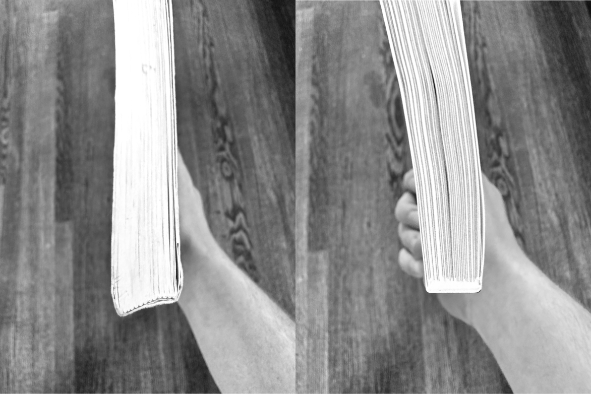
This is the difference, to me, that makes all the difference.
Or as another site put it: “section sewn or Smyth sewn or thread sewn is the Rolls Royce of binding.” Well, it certainly feels that way! It’s immediately noticeable the second you pick it up. But this book is better than just its binding, it’s made up of everything it isn’t as much as what it is: no cheap or weirdly sticky book cover that gets in the way, no hardcover that jabs at your palms as you read, etc. etc. Every detail has been cared for.
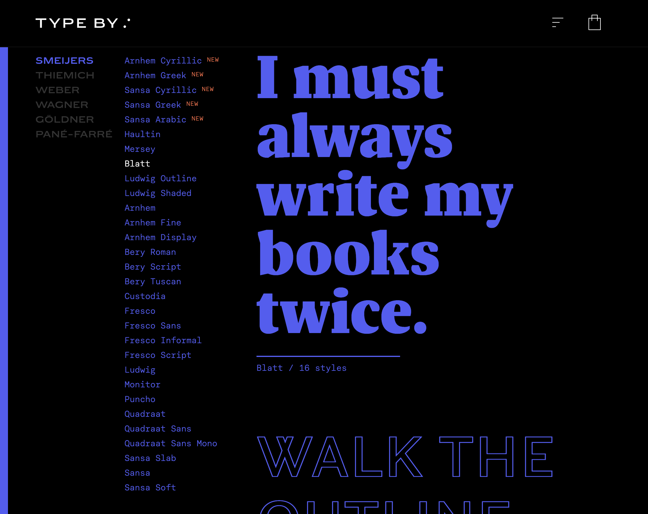
Smeijers also runs one of my absolute favorite type foundries alongside Corina Cotorobai called TYPE BY and it’s worth an evening or two spelunking through the library of work and picking up everything that catches your eye:
What can I steal from Counterpunch then? Well, I’m most certainly going to section-sew the book now, that much is clear. However this put into question what I’ve been clamoring on about for weeks where I mentioned that I want a smaller-than-paperback size for my book. But because Counterpunch is so beautifully printed it doesn’t feel as large and clumsy as any other novel-shaped thing that I own. Counterpunch is actually larger than a paperback! But it feels so light and easy to read in comparison.
I will think about this more and report back.
Also! This week prototype #002 arrived in the mail so I’ll be sure to poke and prod and write up all my anxieties about that for next week.