Hyper-Typographic Book Covers
Friends! Barnes and Noble nerds! E-pals!
If you ask most folks who start work on a book they’ll likely say they started on the first draft, then the second, then the third. They’d talk about chapters and word counts. They’d describe things in an ordered way, focusing at first on the text in the book. Whenever I read about how writers or designers tackle their work it’s always very organized like this—there’s a step one, step two...—and everything is ordered and building on the momentum from the day before.
But this isn’t how I work. Every project I work on I find it hard to focus on one thing at a time. I jump from the writing when I get bored to then fixing the CSS of the website, haphazardly then searching for fun domain names, or iterating on the letter spacing of chapter headings, or playing around with the hex values endlessly. There’s a certain point where things click and the text becomes easier to write, but in every project I’ve come to accept a certain degree of faffery at the beginning. I wish things were more ordered! I wish I could focus on the draft of this book! But alas, I get bored and my attention drifts.
So this week I gave in and began exploring ideas for the cover. What’s the visual language? What do we want to tell folks right away? Well, I didn’t treat it like a regular design exercise like I would with my day job. I don’t care for objectives! I don’t care about impact! I just want to sit on my couch, listen to some Fred again.. boiler room sessions, and goof around in Figma.
Here’s what I started with:

Right? Isn’t this so much fun? Embarrassing work, for sure, but I’d much rather sit around messing around with cover designs all night long then feel stuck working on the drafts for each chapter inside. Anyway, I always hone-in on simple cover designs and I’ve always wanted to mess around with one of my favorite photographs taken of Woodward Avenue, Detroit in the 1920s. I’m not sure when I stumbled upon this photograph but I think about it all the time; folks are walking in the street, oblivious to the letters surrounding them. The introduction to the book begins with this photograph and so it makes sense to make it the thing that ties everything else together.
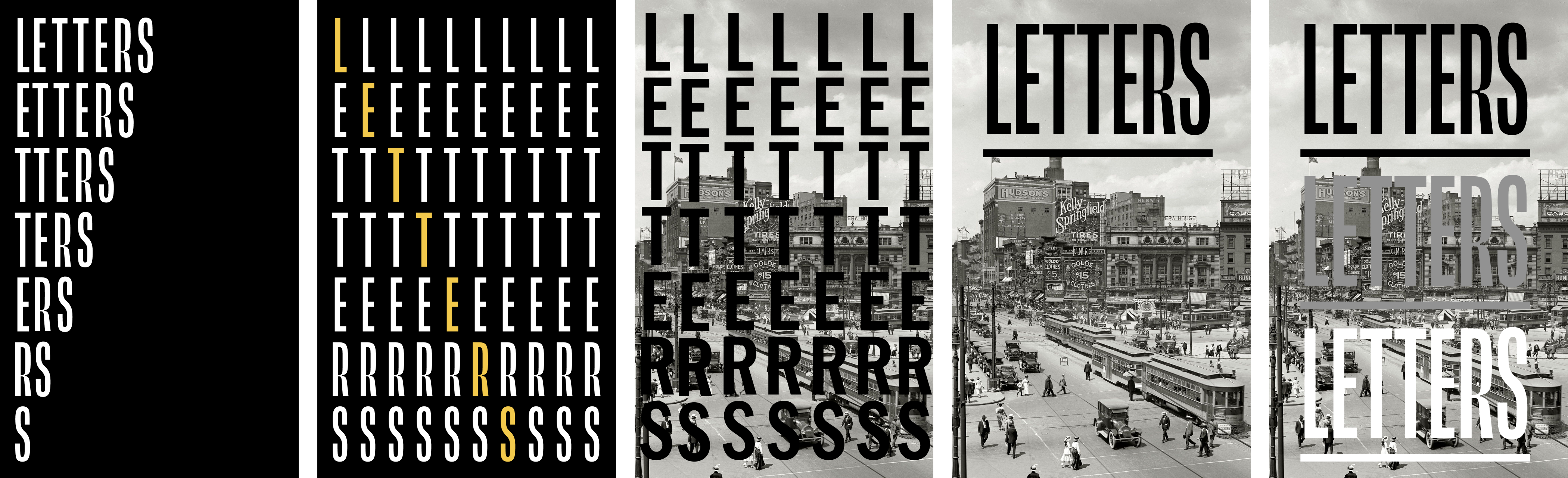
Next, I moved away from photography and began exploring messier, more typographic covers:

I like the black and white starkness of these examples and I could design a cover that’s not as messy but still captures the somewhat rambling, all-over-the-place-ness of my writing. That last cover is interesting, too; a bit more classic, zooming into a part of a character or glyph from the book. It reminds me of Codex magazine for some reason (which was beautifully designed and which I still sorely miss).
After this set of designs I did a bit more exploring along a similar path, this time playing with different typographic options and styles. I think this last one demands more attention and I could turn the “logo” of the book into a kind of pattern that might be used elsewhere...

I realized here that, considering this is going to be an entirely self-published book, I really don’t need to live by the same rules of something sold in a Barnes and Noble. I don’t need quotes all over the place. I don’t need tons of colors or anything. Heck, I don’t even need the title on the cover of the book.
Basically, I can be real weird.
This freedom helped me explore a ton of bad options, none of which I like. But that’s okay! My goal here with these sketches is to figure out possible directions, not possible covers. If there’s a hint of something in the future then it’s worth jotting down now.
With the fourth one above there I could imagine that I photoshop the title Letters to make it look like a billboard or something, towering over the rest of the buildings. But considering I was exploring using that photograph again I was thinking through highlighting the letters in the picture, or masking some part of it in some way and at some point in the evening I realized that I’ve been too strict with color in recent projects, too reluctant and/or scared to push my work into a more colorful place.
You can see that in my mocks below; the precise moment when that clicked.


That middle one in the second row feels promising and worthy of more exploration—I can imagine it being jam-packed full of either letters from the book or from descriptions about the book itself. It doesn’t really look like anything I’ve made before, which is neat.
So these are the options I have so far and it looks like there’s a bunch of promising sketches in here. I’ll keep riffing on the cover and report back when I’ve made substantial progress. But working on this cover has also reminded me that there is a method to my madness when it comes to side projects. It’s okay for me to make this thing my way, to trust in my disorganized process, so long as things keep moving forward.
And this week was one of those weeks.